Thursday, January 29, 2015

Blog #3


Logos: The ad shows a fact/number that says it is #1 brand recommended by dentist. This statistic is used by many different brands so it doesn't appeal to me. However, it just depends on the consumers preference of what they want to use and buy. At the bottom of the ad, in small writing it says "Dentist 2009 tracking study",  this might attract consumers.
Pathos: There isn't an emotional appeal in this ad.
Ethos: In this ad, the credibility is given by having a dentist in a lab coat was the "face" of the ad. Since they used a dentist, it gives the consumers the impression that it really works. If a dentist would recommend it, then it should work. To make the ad more credible, they used 3 dentists instead of just one.

Blog 3


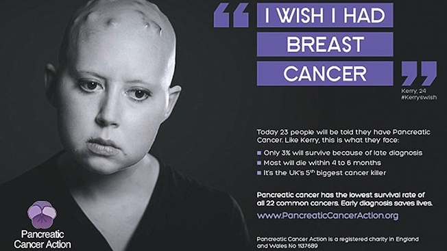
This image is a great example of how all three types of devices are used. It gives you facts, makes you feel emotions, and gives you reasons to trust them.

Logos: This image uses facts and statistics to show that their message makes sense. Why would anybody wish to have any kind of cancer? Well, its because if you have pancreatic cancer, you have the worst chances of making it through. The image does't tell you that bluntly. Instead it gives you numbers and percentages that let you understand that Kerry's wish is justified.

Pathos: The black and white image of Kerry, behind all the words and letters, is meant to add drama to the presentation of this message. The lack of color represents the lack of positive emotions. It relates the image to death as a dead corpse wouldn't have a white smile and soft pink cheeks. The image uses Kerry's facial expression to make you feel sorry for her.

Ethos: The logo at the bottom left corner and the URL presented in this image are the items used to convince the audience that this image is legit and trustful. The URL ends in ".org", which make it safer than a ".com" website. Then you take a look at the logo and ask, "What is the Pancreatic Cancer Action?". So the image explains it at the lower right corner, "... a registered charity in England and Wales...".

Blog # 3

For this post I chose a McDonald's ad for breakfast food
The Ethos of this add is to make the reader feel like if it looks that good and it's from Mc Donalds it must be good.
The logos of this add is to make the reader feel like the product is worth waking up for.
The pathos of this add is that Mc Donald's breakfast is so good it will make you want to get up in the morning.

Blog 3

Logos: The reason or message they want you to obtain from the ad is to go to watch the movie. The use a great story line idea and it comes from a great well know director, so people would go and watch it. 
 
Ethos: The ad is for the new movie American Sniper. It is a true story based upon Chris Kyle and many people were well aware of his reputation and incident before the movie came out. Also, the movie is directed by a very well known director and actor, Clint Eastwood. This gives the ad and movie much credibility and the idea to make the movie was a very big success.
 
Pathos: Emotions can be strong in this ad. The dark shadows of the soldier and the flag can represent a struggle and death. The stern look on his face can give you many emotions except for happy or content. The flag sends us a powerful message that we are American, and to take pride in that and that also gives us the feeling of belonging and togetherness.
 

Blog 3

This is a German add about the harms of drinking. It says with one drink you risk it all, Alcohol will kill.

Logos: The logic behind this is that people know the dangers of Alcohol yet still choose to drink it anyway.

Pathos: It appeals to emotions by being blunt with their wording and with the Russian roulette picture, if a person saw their odds of dying as 1/6 it might change their ideas about drinking.

Ethos: People already know Alcohol is not good for us, and the poster display's that with little other ethos on the ad.  

Blog 3

Logos: The logic fact and cost behind this picture is very obvious. First of all it shows how bad cigarettes are for one’s health. Also, it shows how big the issue of secondhand smoke. The cost of having your beautiful innocent child being affected by your actions.  
Ethos: The credibility of this advertisement is very convincing. Showing a toddler smoking a cigarette, is very disturbing and eye opening. People, and in some cases parents don’t realize at times that smoking is just not bad for their health but also for those who surround them.
Pathos: Seeing this image is quiet disturbing. It arouses a sense of empathy for this child who is just a child and is being affected by secondhand smoke. Also, the face expression of this child, makes it very upsetting. He looks very confused, mad, and upset revolved all in one.

Wednesday, January 28, 2015

Blog 3

This is an ad for nike.

Ethos: All this company needs to sell their product is a picture of the greatest basketball player to play the game wearing their shoes. Because he is looked up to by so many people he not only grabs the attention of basketball fanatics but to fans of all different types of sports. No words need to be said to market their product.

Pathos: The unsaid caption to the picture is if you want to be like the best you gotta dress like the best. Jordan clearly wouldn't wear any other brand and neither should you.

Logos: None. 

Blog #3


Logos: The logos in this ad is the image of the boy who is on the hospital bed. The reason this is factual is because there are places where children are truly suffering.

Pathos: The pathos in this ad was displayed by the face of the child. What I first saw was his face and then I saw his legs and how one of them is missing and is bandaged up. The blank look that the child has is one of beyond a normal sense of pain. The child’s eye is hopeless, and maybe even loss of wanting to continue with the pain that he will have to endure the rest of his life. Someone who has a clean bill of health will feel a lot of emotions, knowing they do not have to suffer through this (hopefully).

Ethos: The ethos in this ad was the simple words that say “Liking isn’t helping,” and this is when the audience realizes the problem. This makes the audience stop and think, and ideally they realize that a “Like” will not return this child’s leg, it will not pay this child’s medical bill, nor will it pay the medication or the treatment costs that he will have to use throughout the rest of his life. Action must be taken to really help those in need.

Blog 3

Exigence: The purpose of this advertisement is to try to prevent people from drinking and driving.  It is letting people know one of the risks that drinking and driving  can cause.

Audience: The audience is all people that drive.  It even affects people that do not drive because they can still make sure their friends or family do not drink and drive.

Logos: The logos in this advertisement was the factual evidence that it provided.  It was specific by using statistics to inform the audience of the problem.

Pathos: The pathos in this advertisement was displayed by the picture of the handicap spot in the parking lot. This made the audience feel sad and aware because they could imagine the tragedies that drinking and driving causes.

Ethos: The ethos in this advertisement was the simple words that when read make the audience realize the problem.  The words make the audience stop and think, and they realize what it says is a problem that needs to be fixed.

Blog #3

*Ethos

  • From what I can see in this image that allows me to know that this movie is going to be amazing is the fact that its directed by the same director that created District 9. District 9 was a phenomenon and an extreme big hit. That is a very credibly source.  

*Pathos

  • What allows the image to appeal to you emotionally are the alphabet blocks, the innocent robotic smile, and the gun. When you see alphabet blocks you think of babies and toddler's, nothing but cuteness. Then you look at the robotic smile and begin to wonder just how happy looking at a smile really makes you. Also its not just a regular smile but the smile surrounded by alphabet blocks makes him seem like a child and very innocent. Innocence causes no harm. Now the gun shows up and what popped in my mind when I thought of a gun was danger and killings. So much emotion is put into one image. 

*Logos

  • I could not find any Logos in this image but if you do Please let me know. I would highly appreciate it, Thank you.

Logos: The reason for this ad is to have people buy Red Bull.  They are trying to win you over with the "cool" factor of skydiving from space.

Ethos: The credibility of this ad is that the company is Red Bull.  They are banking off that most people know what Red Bull is.  They have a reputation of being an energy drink that "gives you wings", which is giving the people the idea of doing the impossible.

Pathos: The emotion in this ad is that Red Bull will let you go past your limits and keep reaching higher.  Red Bull will allow you to shoot for the stars and help you get to your goals.  Red Bull is planning on you to see this and think that if you drink it then you can do the extraordinary.

Blog #3


Ethos: This advertisement is for pedigree and it says in the description that when you buy their product that they donate to help find dogs homes. Pedigree is well-known so it makes you trust them and want to contribute.

Pathos: The picture of the dog, Otis automatically makes you feel sympathy for him and any other animals in a shelter that haven't found a home yet. It makes people feel guilty and want to either adopt or buy pedigree so they can help animals find homes.

Logos: In the bottom right hand corner it says in small print that in 2008 that they donated minimum of $250,000 up to $1 million. So there is information of the costs that they actually do donate and have this fact to prove it.

Ethos - This right here is my boy Nipsey Hussle, and is a rap genius. When it comes to music and living on the streets, he is more than credible. He has sold thousands of albums and has been acknowledged by many artists, he is smarter than your average rapper.

Pathos - Nipsey inserts a lot of passion in all his songs, he makes sure of it. Everything he raps about is true and is about his life, he has faced many struggles and shares that with his listeners. His passion is so strong and felt that people like me feel what he feels when he speaks, and its great honestly.

Logos - Logic is one of the biggest things that he applies to everyday life and music. Nipsey has been making money even before he got famous, he knows how to strategize and slowly think things out. Its a great ability to have especially going into the music industry. He is able to do whatever he wants by setting his mind to it. 

Blog #3


Logos: The poster is telling facts about the dog, Wilma. It gives contact info and information about the shelter organization. 

Ethos: The ad is run in association with a New York Shelter that people might know. They also are using a firefighter, which people usually trust with their lives. 

Pathos: It uses an adorable picture to get you to smile, and it talks about the dog. It encourages to adopt an animal instead of buy because shelters are kind of notorious for having to euthanize animals because of space, so it makes you want to go and save some puppies. 


Blog 3


Exigency:
                The purpose of this advertisement is to sell the new Panasonic nose trimmer. It recognizes that some people have embarrassing nose hair and have trouble removing it. In the poster it says, “Safety Cutting System”, showing that they know some people hurt themselves on accident trying to remove these hairs and they bring the solution to those bad moments with their new hair trimming machine. With this new machine they will be able to do this task with our hurting themselves like before.

Audience:
                The audience that Panasonic is trying to reach is everyday men that have problems with nose any type of embarrassing hair problems. They try to persuade them with their emotions by telling them that you can get rid of embarrassing with not hurting themselves anymore. Panasonic not only uses the pity effect but they also try to add some humor to this advertisement by having the “nose hairs” be cables and make it seem like the nose hairs a really long. Another thing that Panasonic uses to boost up their credibility in this advertisement is by putting someone that to most likely have this problem according to the eyes of our society. They did not draw a man who was physically attractive to have the nose hairs, they put someone who might have trouble with their appearance, because it is not credible that someone attractive will have these problems.

Constraints:

                I think that some possible constraints that Panasonic might have gone through was showing the function of the nose hair trimmer, while making it interesting to the public. Another constraint that they might have gone through would possibly be not using a lot of words to illustrate what they are trying to sell. It is not easy saying, “go buy a nose trimmer”, using only a picture. Panasonic also might have had trouble finding the ideal location to put this poster. They needed to find a place where there would be enough wires so that it looked like the hairs were coming out of the guy’s nose. 

Blog #3

The advertisement I chose to analyze was Fibermesh.

Logos: This ad relies heavily on the use of logic in order to persuade you to buy their product. Being that it states how nothing can compare to Fibermesh fiber of fixing problems in reinforcing your concrete application. With facts stating all of the things that it can accomplish from the ability to reduce plastic shrinkage cracks, resist impact shattering and abrasion to reducing water migration.

Ethos: There are also aspects of credibility in this ad. In part that they state how they have been around for 20 years and used 20 billion square feet of concrete from Disney World to O'Hare International Airport. Which in your mind makes them feel more trustworthy, in that if they are stating all of the big projects they played a role in, they must a leading company in there field. They also said  how you can be sure there product will work for whatever you're working on, showing that they have a great sense of confidence in there product.

Pathos: Emotions aren't strongly present in this ad. But there is a sense of humor in that they show a man with a black belt in martial arts who is unable to make a single dent in the concrete. Taking a comical approach on how we have all seen videos of people punching through layers of concrete like it was nothing, and they are showing how strong there concrete is compared to others.

Blog 3


Logos-  The purpose of this Ad is to showcase Volkswagen's new park assist component.  To show the precision they used a porcupine, surrounded by plastic bags of goldfish on each side.  If there were to be any sort of error the little fish would have tragically died.  They used a porcupine because it is the only animal with a needle like coat that could penetrate the bags.
Pathos- The emotion in this ad stems from the peril that the fish are in.  If it wasn't for the park assist from Volkswagen, the porcupine could have brutally murdered the fish around it.  Other than the fact they used a cute porcupine to catch the attention of an animal lover, there isn't much emotion in this advertisement.
Ethos- Volkswagen is a very well known car company.  They have been around for a very long time and have produced reliable vehicles for many years.  Their good reputation for being a luxury car is, in my mind, good enough for this ad to be credible.

Blog 3


Logos : The logos in this ad is mainly the fact that "Kids of teen moms are twice as likely not to graduate than kids whose moms were over age 22". This is interesting because I really wonder if that is actually that accurate. It says that they are twice as likely not to graduate but in my opinion I feel like it all depends on the person.

Pathos: The main pathos of this ad is obviously the baby crying. This appeals to most people because seeing a baby cry is a sad sight. The audience that this ad is trying to reach out to is teenage girls. It is telling them that if they have a kid as a teen that it wont succeed and that's pathos in itself, the fear that your child will be a failure.

Ethos: The credibility of this ad is the Human Resources Association. This association is well known and typically most of their ads involve facts that make you want to live a better life.

Blog #3


Logos: The audience that is attracted to this add are people who have busy lives and are constantly fixing schedules and and fitting every and all daily activities into their lives. People who have constant Post- its or mental notes "need" the palm. This ad appeals to the logic and order. This person's hand is covered in notes and is surrounded by a busy city with a lot going on in addition to al tasks written on the hand. The Palm organizes all the reminders written on the hand in a small handheld device without all the chaos in the background. The only logical thing to do, according to this ad, in keeping everything organized is to purchase a Palm. 


Blog #3


Logos: There isn't really logos in this particular advertisement; however, a majority of people already know the alarming suicide rates for the LGBTQ+ community.
Pathos: Although the ad is simple, it provides a huge message with the use of the noose spelling out "homo."  It can definitely cause someone to realize how hurtful and offensive a word like this actually is.  When suicide is mentioned in an ad, it brings about serious and remorse feelings regardless of the kind of ad that is present.
Ethos:  The Trevor Project is a widely known suicide prevention organization focused on the LGBTQ+ community, so they definitely are a credible source for this type of advertisement.

Blog 3


Ethos: The credibility of this advertisement comes from the brand called, Avia.  Avia is a motor oil company that was established in 1927 by Swiss, petroleum importers.  The Avia brand is represented by more than 2,900 petrol stations and over 80 member companies in 14 european companies.  This shows a sure sign of quality, service, and credibility.

Pathos: In my opinion, I would say that this image is giving off a playful nature and emotion.  It is comparing this huge horse to a little kitten playing with a ball of yarn giving off a comical feel, which in this case is trying to influence you to choose Avia oil to make your engine smoother for better horse power.

Logos: There is no real logical explanation behind this advertisement.

Blog 3

This advertisement is used to promote Colgate optic white toothpaste. The illustrators also managed to make their audiences attention go right to the “need" with the color scheme they used.  Everything is red to make her teeth look whiter. This advertisement is most likely found in magazines that are focused on image and beauty.  This is where it will be seen by their targeted audience.  This image appeals to anyone who cares about their appearance or health. The age range for the targeted audience is probably anyone over the age of 13, and I believe it appeals to men and women equally.  Men are attracted to the pretty girl with the white smile, and women want to be the pretty girl with the bright smile.  

ETHOS
Ethos is what this ad is based on. It establishes the credibility by flaunting the brand, Colgate Optic White, and by having their Ambassador is the model on the advertisement.  She also signed it almost as if to say, “I approve this message.”  
LOGOS
This ad has a statistic, stating that using the product for a week makes your teeth get a full shade whiter.  It makes it logical for anyone to want to use/buy.


blog #3


Ethos: This advertisement is sponsored by Amnesty International and they are an organization that focuses on human rights with over 3 million members and supporters around the world. They conduct research and perform action to demand justice for those whose rights have been violated. This organization makes the ad very credible because of how well known and successful this organization has been on protecting human rights.

Pathos: Looking at this ad makes you feel very sad, and it gives you a desire to try to help. It makes you wonder what this innocent little boy has gone through, and how much terror he must feel. The black eye on his face shows that he is a victim and how painful it must be for a victim to go through abuse. This ad indicates that we must raise our voices if we experience any behavior like this. It persuades people to act for this cause.

Audience: The audience for this image is the victims that go through this torture everyday and don't have the courage to tell someone. This is an issue now everywhere in the world, and by using websites and the internet to inform people about these worldly affairs can make results more effective. Another target audience can be our younger generation so they can be more aware of these types of situations.

Blog 3


Ethos: The credibility in the ad is the company Mitsubishi. They are a huge company and make a variety of electronics and pother products, including automobiles. The credibility comes from them being around for so long.

Pathos: The Pathos in this ad is that you will fell strong like a rhino when you are driving their product. They also are trying make you feel like it is a natural thing for us to be driving around something as big as a rhino.

Logos: The logos is very similar to pathos in this ad. It is that the SUV they are selling is a strong as a rhino.It doesn't make much sense but it is what the ad is trying to covey. There is not a lot of logic in today's advertisements.

:

Blog


Ethos: The credibility would be the name brand name GoPro. It is a very well known company that sells action cameras and the name attracts people. Also every advertisement photo or commercial is taken by their product so you are able to see the quality of their cameras.

Pathos: This advertisement realize heavily on pathos. At first you are overwhelmed with all the amazing things going on in these pictures but you can clearly see the brand name. They are trying to motivate people to be a HERO by using  incredible pictures that people have taken with there product. You see people parasailing, surfing, snowboarding, kayaking, sitting above the clouds and scuba diving under water on a bike. They're able to capture all these amazing things on a GoPro which could amaze potential buyers to purchase their product.

Audience: The audience could be everyone, the advertisement does a good job showing that you can capturing almost any moment you want in good quality. Therefore the audience could be anyone that wants to buy a camera that can capture (record or take a picture) any moment of their life.    

Blog 3


Ethos - These photos are credible because were taken by a famous photographer in Washington named Michelle Newell. Mrs. Newell has been a photographer for about eight years and wedding photos happen to be her specialty.

Pathos - This shows emotion because it is the grooms first time seeing his wife to be and he's crying. It is such a heartfelt moment that makes girls think about whether or not their grooms will cry when they walk down the aisle.  He's looking at her the way all women want to be looked at by the man that they plan to spend the rest of their lives with.

Audience - The audience is everyone, everyone can look at these pictures and look forward to the day that they will be in the couples position. The more obvious audience would be people who are engaged and are looking for a photographer.

Constraints - The major constraint would be taking the pictures at the right time. If Michelle took the picture while the wind was blowing a little too hard the veil would have covered the grooms face.

Blog #3


Ethos- James Patterson is a very well known crime writer. This is why he puts his name in big letters so everyone knows this is his book.
Pathos- When someone sees this cover there is a certain mystery involved. The reader does not know why there is a man running in a dark foreboding blue fog. This makes them feel curious and interested to find out more.
Logos- The statement on the bottom claiming that James Patterson is the world's bestselling thriller writer definitely makes people want to buy it. Just seeing that statement they can logically conclude that the book will be good.

Blog #3

 
Ethos-
This ad is extremely credible because of the brand coca cola. Coke has been around for years and it is popular all over the world, which is also implied in the ad. Just the brand itself is what makes this ad credible.
Pathos-
This ad depicts Coca Cola as the "friendliest drink on earth". This makes people feel like drinking Coke is a good thing and it will bring people together and make them happy. The hand holding the bottle looks strong and rugged which is kind of powerful, while the earth in the background shows how Coke is popular all over the world, which makes people want to drink it.
Logos- I didn't notice any logos in this ad, the ad is very "to the point" with not many words or explanation.

Prompt: Blog 3

For Blog 3 you should be working with the rhetorical appeals we played with in class (pathos, ethos, logos). As we saw in class, all three appeals might not be prominent in all images, and that's fine. Don't wrack your brain trying to make it fit. It might might be interesting to consider why a rhetor would avoid a certain appeal.

Just a reminder: you should be finishing "Backpacks vs Briefcases" for next class, too.

Blog #3


Ethos- The credibility would go to the company in the lower right hand corner of the picture, though it is very hard to read. This is one of many anti-smoking campaigns most of which are provided by credible sources such as medical foundations or organizations that specialize in smoking and its effects.

Logos-The logos for this ad would be that logically the facts have shown that smoking kills a great deal of people every year from a variety of diseases such as emphysema, and lung cancer to only name a couple. Also it shows how it not only hurts the person smoking but the people around them from their second hand smoke. Logically this would make sense when someone is smoking the second hand smoke drifts into the air and into the lungs of surrounding people.

Pathos-I think that the pathos on this ad is very apparent, when it says "Don't kill yourself and us too.". They are really trying to make the audience emotional in some way over this ad. It may make some people think "What if that was my child? Or someone I love?" or "Why do the innocent people have to pay the price of another person's unhealthy habit?". They're trying to convey that smoking does not only hurt smokes but innocent bystanders as well and that people who smoke should not only think of themselves but of all of the people around them that they could potentially be hurting as well.

Tuesday, January 27, 2015

Blog 3

Ethos: The ethos in this ad is the soap having a well known name brand. It will attract the consumer if they have knowledge of this brand and if they trust the name brand as well.

Logos: The logos in this add would be a saying on the bottle saying that the soap kills 99% of all germs stated by a health professional. When reading that, a reader can trust that the soap will be almost 100% effective.

Pathos: This ad is largely relying on pathos. When people see this they are disgusted at the sight of a lady holding onto decapitated gross hands. The lady is on a bus and is seen as just a typical person that most people can relate to and put themselves in her position. By seeing this they will think twice about not using soap and possibly buy this soap to prevent having someone's germy hands on them all day.

Blog 2

Exigence: The purpose of this ad is for Disney to draw in families to take a Disney vacation. Due to the fact that its not specific to any type of Disney vacation, this ad is covering all Disney parks as well as Disney Cruise Lines. This is effective because it isn't specific to just one Disney vacation spot. The reason for this add is to show just how much fun a Disney vacation is and how happy you will be if you take one. Also with the pixie dust shown in the add it can also make you infer that Disney is truly a magical place and your vacation will be magical.

Audience: The ad pertains to young children most likely from ages 5-10 and families with children of that age as well. Also this ad is for young boys due to the fact that there is only a boy shown and Goofy(a male character) is the only Disney character shown.

Constraints: Although Disney may be a fun vacation for all ages, in this particular ad it is only pertaining to kids of a younger age. People that don't have children from ages 20-80 most likely wont connect to this advertisement like a younger person would. Also this add is online so people without internet access wouldn't be able to see this ad.

Blog 2


Exigence: The purpose of this ad for Sisley is to make people want to buy their product by making their fashion seem irresistible. They use the dress as a symbol for cocaine and the girls look to be "addicted". They use the slogan, "fashion junkie" as a strategy to sell their product but using a very peculiar way to do so.

Audience: The audience for this ad would be directed towards younger adults who want to have good fashion, both men and women that have expensive taste. It obviously isn't directed towards children because they wouldn't understand the concept of this advertisement. 

Constraints: I think that some people would be offended of this advertisement because it's advocating that doing drugs isn't a bad thing. But also, some people might be curious and want to see more about what Sisley is and check out what they're clothing and other products are. So if people are offended by this then they will lose sells on their products. 

Blog 2


Exigency: The purpose of this advertisement is to promote Carl's Jr's business and profits by making people want to go and buy their food. The ad is showing a very attractive women eat a six dollar burger in order to hopefully gain more attention, rather than just a standard boring commercial. Putting the woman in a bikini and having her eat it seductively and putting her on the beach almost compares eating a Carl's Jr burger to heaven.
Audience: The audience of this ad is mostly men, ages 16-30. Teenagers and young adult men will respond to this more than usual because of the woman shown eating it. This ad has almost no effect to have the population, women. This ad was mainly to get the guys' attention. The beach, the girl in the bikini, the huge burger she's eating, all things guys like.
Constraints: One constraint is the audience. This ad will not appeal to women nearly as much as it will to men. Also, Carl's Jr. must pick the right time to show it. Sunday cartoons or during a kids show is probably not going to be effective nor appropriate. It won't be very effective unless it is shown right before meals, such as lunch or dinner.


Exigence - It is clear that the ad at hand is using satire to illustrate the new space that has been added to the vehicle. A kid usually takes his teddy bear anywhere with him, but now that his soccer mom bought a larger vehicle he is able to take any of his large teddy bears on the go. By making something humorous and blowing it out proportion, the viewers will be able to understand quickly. The ad is telling you that now you have all the space you ever needed for your vehicle.


Audience - This ad is for anyone who is looking for a larger car for any number of reasons. Some want to build a family, and maybe having a larger car might be the foundation of that. This is also for the skeptics who believe that Volkswagen only produce small cars, but the company says otherwise. Or even anyone who is just trying to make money using their car.

Constraints - The problem with this ad is that it is too direct. Immediately the audience reacts to it, and recognize whether the ad is for them or not. The ad is mainly directed to family's and parents, because they generally need a lot of space to fit all of the family's essentials into one car. A major constraint is the fact that a large percentage of the audience won't react to the ad because it does not pertain to them.

Blog 2


Exigence-  The purpose of this image is to inspire the younger generations to get out and get some daily exercise.  It is sometimes a very daunting task to go and work out.  This ad is essentially saying, " If this young kid can get up and go running, you can too".   Sometimes people are scared because they don't know what kind of results they will get, but you will never know unless you get out and try it.
Audience-  The Audience of this advertisement is primarily young teenagers and overweight people. It is geared toward younger people, however it could inspire a person of any age.  When younger people who are self conscious about their body see this young boy exercising, they may feel a sense of motivation.  It doesn't matter how fast of how far he is running, it just matters that he is giving an effort to try.  
Constraints- The constants in this ad would have to be whether the viewer cares about health at all.  If somebody has no regard for physical fitness they probably would find much motivation in this picture.  This ad is also of a younger boy, so people in their 20's and 30's may not see the inspiration a young teen may see.  

Monday, January 26, 2015

Blog #2


This image really piques my interest just by the way they persuade women with makeup by making her eyelashes standout and by really convincing you that your eyelashes will look that perfect.

Exigence
The exigence in this image is to try to convince a woman that using makeup will make her look attractive, younger, or better. In the image they make her eyelashes look perfect to persuade women that there eyelashes will look exactly like they do in the image if they purchase the mascara. They also use an attractive woman to promote that mascara will make them look more appealing.

Audience
The audience is intended toward teenage girls and women in there 20s to 30s. It's meant to make women feel more attractive and to feel good about themselves. Its common for women to have self-esteem issues, and makeup tends to make women feel beautiful or even feel younger.

Constraints
The constraint in this image is not knowing if your eyelashes will come out as perfect as the woman in the image, or even if the mascara will work well with your eyelashes since everyone has different types of eyelashes.

Blog 2

 
Exigence: The purpose of this Paper Magazine Issue of Kim Kardashian was as stated, for Kim to break the internet! The slogan of this issue was very cliché in a way, however it did meet its purpose. Kim Kardashian definitely did break the internet with her 3 Paper Magazine shots. The legitimate purpose of this issue was for Paper Magazine to sell and become more known, due to Kim being the cover of the issue. Another purpose was for Kim to publicize and enrich her fame.
Audience: The audience for this cover would be those who purchase Paper Magazine. Also, for the fans and those who dislike Kim Kardashian.
Constraints: As one of the major constraints of mostly every single magazine cover will be the amount of space the magazine has to work with, however Paper Magazine did not seem to have an issue with the work space they have. The magazine cover is very clean and has a lot of open space. A possible constrain they might have encounter was getting a clean shot of Kim popping a champagne bottle directly into the glass perfectly sitting on the top of her bottoms. 

Blog 2


Exigence: This is an advertisement for the Paralympics.  It features the journey of a young athlete who has experienced a great tragedy, but has overcome it by dedication and hard work making him unstoppable.  The purpose of this ad is most likely to make people aware that you don't have to be whole to be great.  Everyone has their bumps along the road, but it does not have to hinder them from achieving their goals.  Just like in the picture, no matter what hardship you go through, you can still leave your heart out on the track and maybe someday come back to it.

Audience: The ad could be dedicated to anyone that is a fan of the Paralympics and they don't have to be handicapped to be inspired by it.  It takes a lot of courage for these athletes to overcome so much hardship and pain and to continue doing what they love.  

Constraints: One of the biggest constraints I see in this photo is that it pictures the journey of and amputee athlete.  Though there are many amputees in the Paralympics it is not the only disability. Others include: muscle dystrophy, vision impairment, hypertonia, and much more.

Blog 2

Exigence: The purpose of this advertisement is to encourage people to get in shape.  Nike is trying to say that by getting in shape you will feel better about yourself and that will make you have a better life.  Nike uses this advertisement because it makes people want to workout, and to workout you need athletic clothes, and Nike is hoping you will purchase it from them.

Audience: The audience will respond to this advertisement in a positive way.  The audience is mainly women.  When people see this they will want to workout, so they can improve their selves and their lives.  Nike purposely used women that are attractive and in shape, so women can look at them and want what they have.  Also, the two women in the advertisement are different races, so this makes it more relateable  to a larger span of people.

Constraints:  A constraint for this advertisement is some people do not care how they look or if they are in shape or not, so if they saw this, it would not profit Nike.

Blog #2


Exigence: InTouch is a gossip magazine that provides stories about celebrities. This issue features Bruce Jenner, a former Olympic athlete or better known as being a part of the famed Kardashian family. The cover addresses the many facial surgeries he has undergone which have made him look more feminine. The cover artist enhanced his picture by adding lipstick and blush to make him appear as a woman. The editors seem to be shaming Bruce for plastic surgery. If the rumors are true about him wanting to be a woman, then it is also shaming people who feel uncomfortable in their own skin and feel like they need a change.

Audience: The Kardashian family is constantly in the spotlight and so a "huge bombshell" like this is front cover worthy for the editors.  InTouch is a common magazine on the stand at local grocery stores so while waiting in line people of all ages read the cover recognizing him from the hit show Keeping Up With the Kardashians. People have can have positive and negative reactions to the cover because it has a shocking photo. The audience probably will not have enough time to read the entire issue in line which may result in them buying it to read it later.

Constraints: The cover has limited amount of space so the front picture needs to be an attention grabber. The writing on the front is minimal but brief bullet points and sentences to make the audience pick it up to read.


Blog #2

*Exigence:


  • This is a South Korean Advertisement which was lit along a sidewalk and features a young boy and a man threatening him. On the Corner of the AD it says "Child abuse, can you prevent it". Passersby will see their shadow on the sign, allowing them to symbolically intervene. The purpose of this AD is to empower bystanders when the act of child abuse is happening. The AD spreads awareness of child abuse.    


*Audience:

  • The AD uses an empty wall next to a side walk to attract people into wondering what it is for.   It seems that the Advertisement is aiming to aware everyone. The Ad could be seem by people who are mothers, siblings, other family member's and even strangers. It is put in a location that allows everyone who passes by to see what  heroic act  you create. So in my opinion the audience seems to vary.

*Constraints:

  • One of the Constraint is that your shadow does not truly reflect whether a person will take action or intervene when a child is being abused. Another would be that people do not really know the dramatization of abuse. It  may not seem so important to them even if its a child. Also the location is uncertain. 

Exigence: This is an advertisement for a spring break event.  There purpose is trying to get people to spend their money and go to this event.  They recognized the need for people being able to enjoy their spring break and not waste it doing nothing.  They are providing the solution of going to a huge party instead of sitting at home on the couch.

Audience: The audience is normally directed to younger people around the ages of eighteen to mid twenties.  They are using many bright colors and a huge party to attract the college scene.  They use a lot of different types of artists so people will hopefully go to watch their favorite artist.

Constraint: Some of the barriers to overcome is the ad space.  They might not be able to fit all the details on this one page, so they have to decide all the important parts that people are interested in. The price would be important because they want to get a lot of people's attention but might not have enough money to put it everywhere they want.  Another is where they will put this flyer to get the college crowd to notice it.  Also they are not able to show drinking in this picture.

Blog # 2


Exigence:This is a picture from 2012 of a Toyota Tundra pulling the last space shuttle on a trailer. It is used to inform people about the towing capacity and other ability's that the truck has to offer. the intention of this picture is to make you want to buy the truck.
Audience:The audience can be as broad as everyone. the target audience is any one who is looking to buy a truck or new car.this would appeal more to someone who pulls things with there car.
Constraints: some constraints would be the time frame that Toyota has market the fact that they did this because not many people care about the space shuttle program any more. also people who don't drive or who use public transportation.

Blog #2

Exigence: This is a poster for the Movie Interstellar, It is used to inform the audience about the plot of the movie, give away some exposition. Its intention is to make you want to come and see the movie.

Audience: The audience can be as broad as everyone, or anyone passing by a billboard or Movie Theater,  but this particular poster might more appeal to sci-fi movie goers due to the Astronaut and Space back ground.

Constraints: The constraints are the size of the poster, budget of advertisement for the film and where the actual advertisement could be put. Another constraint could be seen as informing what the movie is about without giving away the entire movie.     

Blog #2

Exigence: The exigence in this image is to show that not everyone who is quiet or seems to be lacking in any department has the same inner appearance.  There are many people who want to be outgoing, want to be a large part of a conversation, or just want their creativity to be noticed, but they might not be able to fully express their thoughts.  It shows that sometimes a person can't fully express themselves, and as you can see from the person, it's not their fault and it could be hurting them.  Despite what you see on the outside, that person could have an entirely different thought process going on in their mind.

Audience: The audience for this image is anyone who might feel this way.  I know I immediately connected to this picture because I feel this way throughout every single day.  It could be meant for people who are suffering from depression, anxiety, diffidence, or just a lack of motivation.  I don't believe there is an age or gender bracket for this image.  Or it could just be an attractive picture to people who enjoy images with a bit of color in them.  

Constraints: This image definitely has a limit to the type of people who view it.  I'm sure most people have moments in their lives where they do feel as if this image describes them in that moment.  However, I feel as if this image is for those who struggle with these kinds of things every, or most, of the time.  This type of limitation can really get to people, and I strongly believe it is mainly meant for them, but that could also be a limitation because not everyone is able to connect to it.

Source: http://staystreet.co.vu

Blog #2


Exigence: This image is responding to the whole idea that the length of a woman's skirt/shorts/whatever says something about them as a person. It's purpose is to make people think about how they view a person and the assumptions that they make about them based simply on their clothing or how they dress. 

Audience: The audience is everyone. Originally, this photo was a high school art project from tumblr user roseaposey.tumblr.com, who posted it on tumblr. Since then, it's spread around the internet. 

Constraints: One thing that could hinder this is that there's no way to tell if it could be spread around. It could have just been posted and then forgotten, with no one seeing it. Another could be keeping it "appropriate", however, even though it could be considered a 'provocative' picture, there is no sexualization, and in fact is actively fighting the idea that a women's body is just for that.